Breaking down the "Perfect" SaaS Landing page (step-by-step)
The underlying principle here is answering the target customer’s objections (more info on step #2 and #3 of my free email course) all over the website so the website alone can mostly convince them that the product or service could be the solution to their problem or at least make them curious enough to fill a contact form, get a free trial or to request a demo so the sales team can follow up until they actually become a customer.
This will be a breakdown of a concept Landing Page for a fictitious product based on the biggest problems I’ve noticed when improving my client’s websites.
🎁 If you also want my 5 step process to go from diagnosing problems to improving conversion (and capturing more leads) you can get my FREE email course here.
Structure is super important when changing or building pages focused on conversion rates as it allows you to have a clear and repeatable process to present anything you want to sell in the best way possible.
Luckily for you, I will be sharing how I structure a SaaS Landing Page and you can apply it in whatever context you need your product/service needs.
The structure of a conversion driven Landing page should contain the following (in this order!):
The Header
Initial Social proof
Introduce the problem
How it works
Show how they can use it
More Social Proof
Final CTA
Alternative CTA
More info on each section and how I designed them below 👇
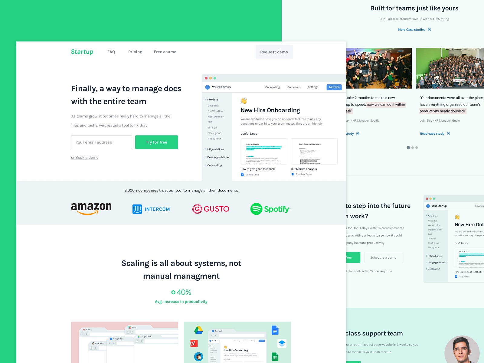
The Header
This is your first impression your company will have on a potential customer and in a world of super low attention spans, you really need to introduce the “big picture” of the problem you will be solving, a small paragraph describing what the solution could be and hopefully an image to show what the solution might look like.
Introduction — this title is supposed to start answering the first objection that comes up “What is this?”.
Supporting text — take advantage of this paragraph to support and briefly explain how the solution works or what problem it will be fixing.
CTA’s — some people might be ready to try it out either because they are more open to trying things out or because the problem you are solving is a HUGE pain point for them. Regardless, you should always have clear and visible CTA so if people are interested in trying/buying they won’t have to look for the CTA and trust me, this is more common than you might think …
Preview — you can’t trust that people will read your copy (and trust me they won’t) so you need to show what the problem or your solution could look like to provide more context and support the other three key points of this section
Requirements for a good header:
Briefly answers the questions
What it is?” and “What does it do?
Creates interest to keep browsing the page so you can continue to pitch themHave clear CTA’s that have a lot of contrast and stand out in case people want to convert.
Showcases what the solution or the problem might look like. As you can see in the fourth point with the image of the tool as an example.
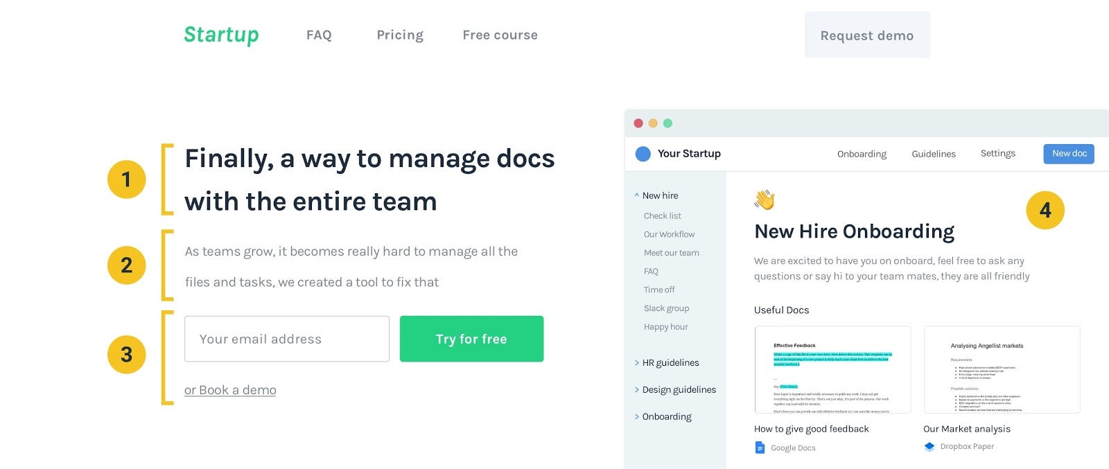
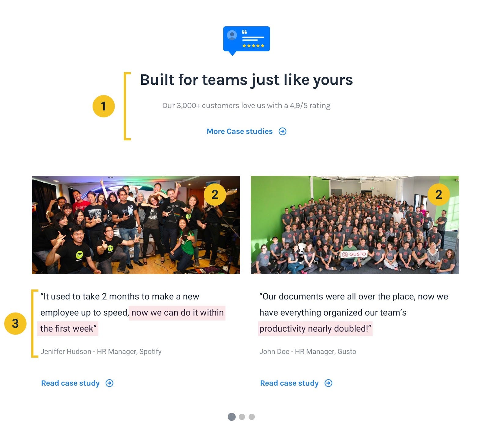
Initial social proof
The purpose of this section is to create authority early in the page so not only they would trust more the solution you are pitching but any explanations or more social proof you have to back it up further down the page.
Don’t forget to explain to people why these logos are here, this is also a great place to make the social proof more powerful as you can see with the example “3000+ companies trust…”Usually the logos of the biggest companies in your niche using the product or the best press releases are the best options to create that quick boost in authority you need.
Keep in mind this is not the right place to keep testimonials as this is supposed to be an easy to understand sneak peek of your results and to build up the social proof until you showcase the testimonials or case studies further down the page.
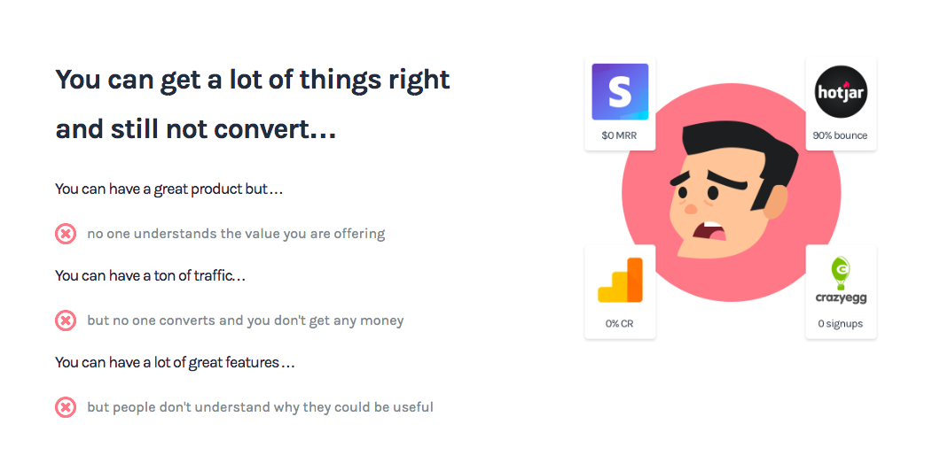
Introduce the problem
This is super important, it’s makes understanding the problem you are solving much easier (as a result the solution is easier to understand too) but also to remind them of how painful that problem could be and how much they could want to fix it (hopefully they see your product/service as the solution)
It’s very rare to see Landing pages that describe properly what problem they are solving before they explain how they can be fix it.
No wonder potential customers quickly come up with objections like “I don’t understand how it works” or “I don’t know if it can fix our problems” … This is such an easy way to avoid those!
The Title — make sure you present either the problem or how their current way of doing things is broken, don’t be afraid to be more polarizing here as in the end it would make everything clearer for your target customers
The Statistics — super easy way to provide context on how bad the pain points are, how much you understand them or how much they can be improved. This might be something your target customers might not be constantly aware of, especially when they visit your website so by reminding them of their problems you are just going to make your offering a whole lot more beneficial in their eyes than if you hadn’t.
Preview — an easy way to support what you are explaining is to have at least one image. Even if you don’t have design skills you can just use a screenshot of having a lot of notifications, a busy inbox, messy tabs or whatever your target customer could relate to.
The Copy — Use the same structure as the copy in the header and make sure you can explain the points as briefly as possible, you can even use those red signs to make it stand out even more and therefore more likely to be read.
Look at how I use the problems my target customers might be having even if they are, in theory, doing a lot of things right.
This makes it seem that conversion is being the bottleneck for their success which is great as I explain how I can fix it shortly after, making them see me as the solution. Very powerful stuff!
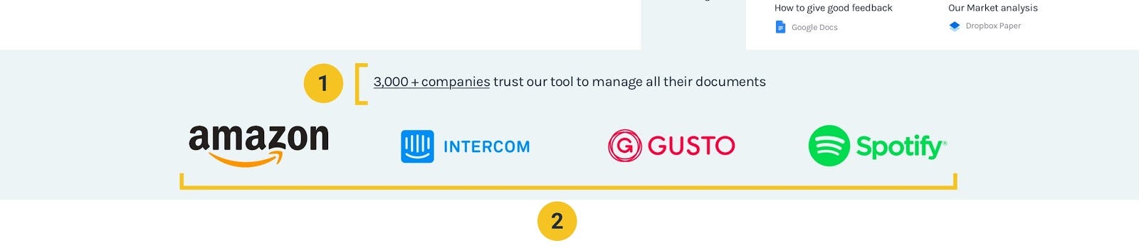
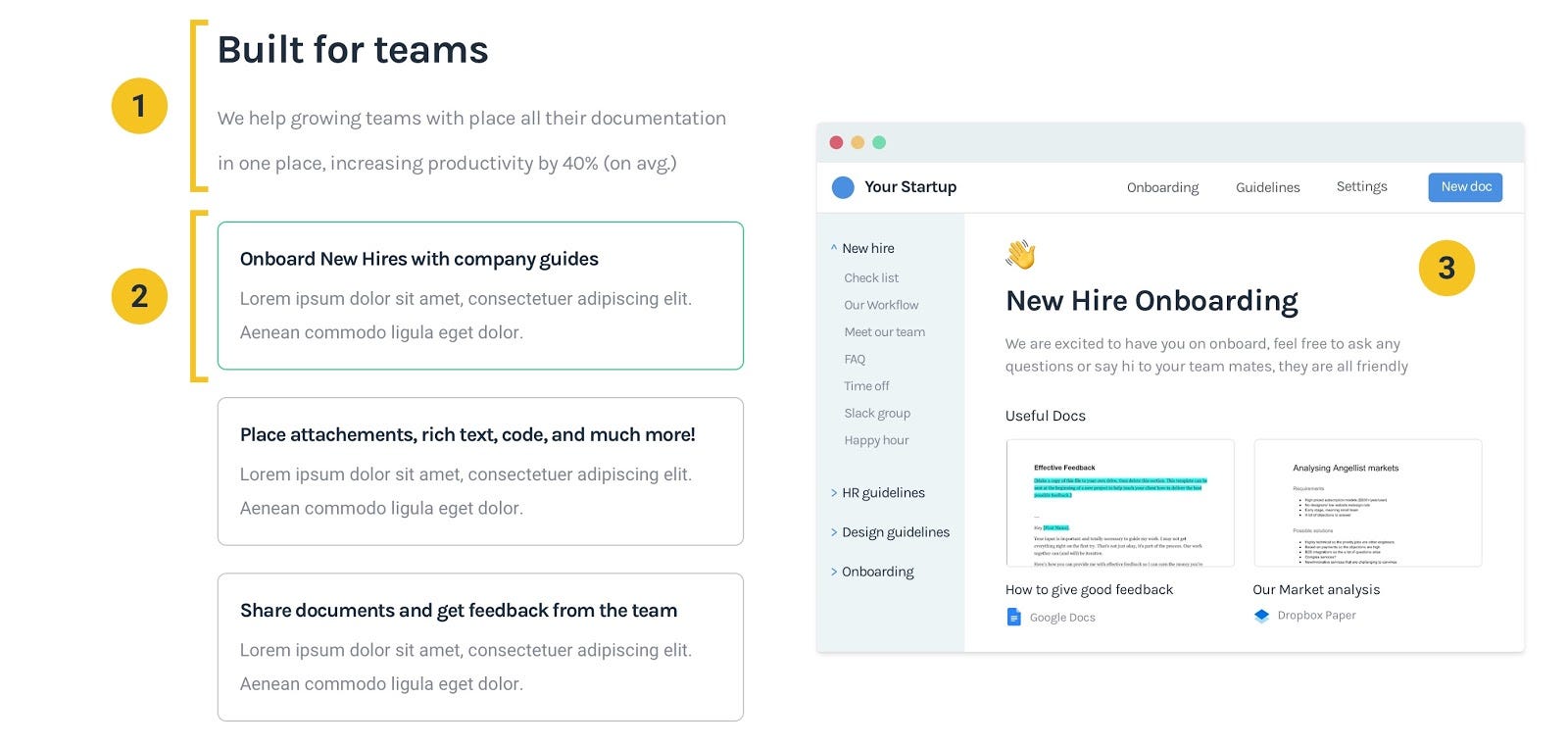
How it works (aka how your product/service can fix “X problem”)
After introducing the problem you can fix, it’s time to show exactly how you would fix it and what are the benefits of fixing that problem or using your product/service in particular.
The Title — use it to grab more attention or as a contrasting point to the title you used when explaining the problem. For example, If you wrote “Doing X thing manually takes forever” in the previous section try writing something like “We automate X thing you were doing manually”.
The explanations — make sure you either explain step by step (3–5 is ideal) how your product/service works or how it could solve the top 3 problems outlined in the previous section. Make sure you are being as specific as possible and don’t write things like “We make X thing better/faster/easier” as that doesn’t really mean anything.
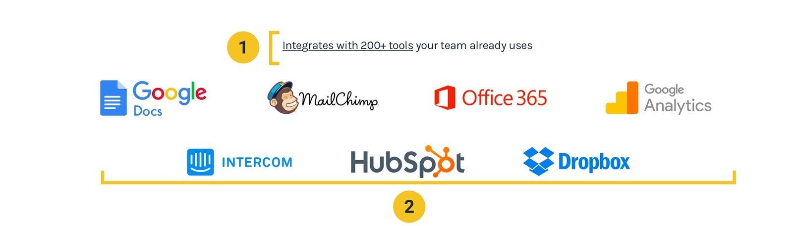
Reinforcing benefits
Adding examples and/or statistics to a section to help support how good your solution is, is a great simple tweak to keep adding unconventional ways of social proof to your website.
In these examples I made sure people knew that the product could integrate with the tools they use the most and therefore reinsure this could be a good and established solution for their problems.
Like in the companies logos explained above don’t forget to introduce why the logos are there. This is a good place to explain really how many tools the platform can integrate with as you can’t put that many logos on the page (even though I have seen a couple companies doing that before…)
Make sure you use the logos that are the most recognisable for you target customers otherwise it can backfire on you by creating a bad impression.
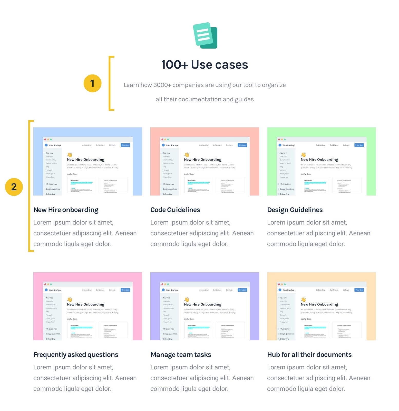
Tell them how they can use it
An easy way to make people realize really how valuable your offerings could be is by showing them how they could use it to get better results. This is super powerful because it’s not you telling them how it would be beneficial, it’s them realizing it for themselves!
The Title — just a quick explanation that this is a section to explain the use cases make sure you keep it simple so it’s easy and fast to understand.
Description — you can also use this part to explain the benefits instead of use cases depending on what information you have to explain
More Social proof
Now that people understand which problems you are fixing and how you can fix them, this is the time when they start to wonder if you can actually get the results they want, it’s the most effective time to bring testimonials and case studies up.
Make it relatable — in order to make your target customer trust the testimonials even more, you need to make sure the copy is as focused on them (or similar companies) as possible. This shows that if it has worked for other similar companies it must work from them too.
Images are powerful — you can’t trust people will read the testimonials but you can show well known people, images of similar companies or companies even bigger than them to capture their attention and increase the likelihood they will read and trust the testimonials.
The actual testimonial — use result driven testimonials as much as possible as that is what people will be buying in the end anyway. Try to keep them short and highly the benefit/result driven so you can control better how people perceive the value you already provided to other customers.
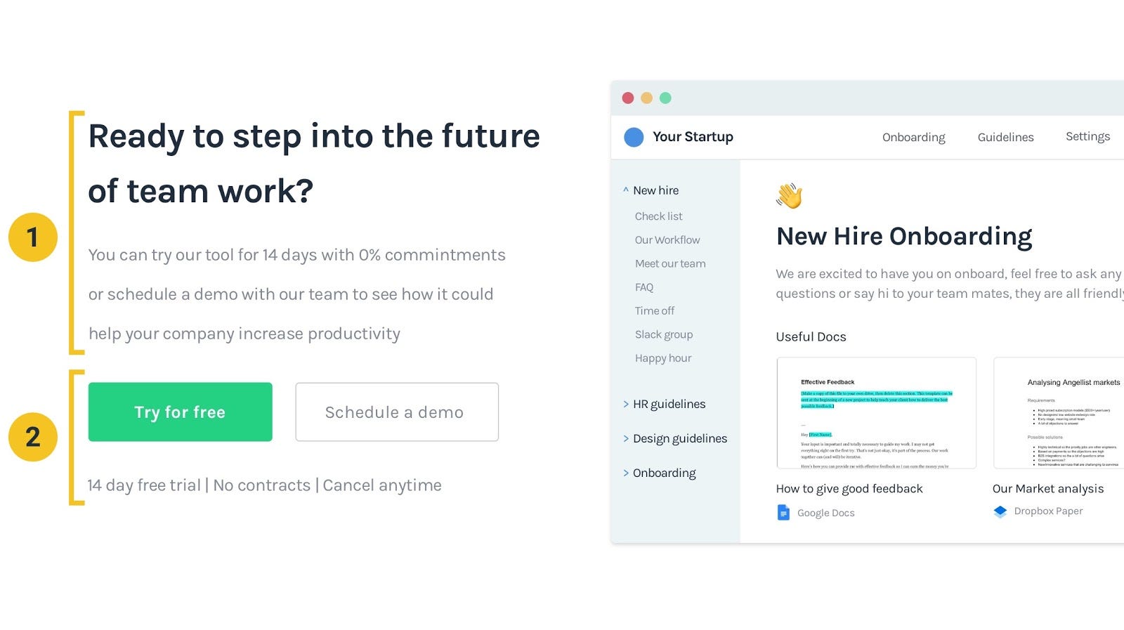
Final CTA
Since you went through all this effort to explain how good your product/service is some people will be ready to convert, give them an easy way to do so before you lose the chance the grab them making that potential customer click away, never coming back…
Clarify the next steps — make sure you have an indication of what the next steps after clicking the CTA are so people perceive it as a smaller commitment and therefore become more likely to click through it.
Clear CTA’s — always have visible and simple CTA’s so people can find them and make a better decision on whether or not they will convert. Since some potential customers will have more objections or less patience than others it’s always a great idea to add alternative CTA’s that are lower in commitment and that could still capture those leads (like you are seeing here for scheduling a demo).
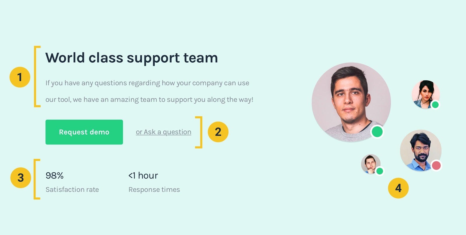
Alternative CTA
Different people will have different questions or even be more or less likely to convert, these alternative/lower commitment CTA’s are a meant to still grab some leads that you might have not captured if you didn’t use them (even if they are higher up in the funnel)
Focusing on demo’s and conversations with the team
I’m explaining why they should reach out or schedule a demo while mentioning there are people in the team just to support them on solving their problems which is much more effective than simply asking them to schedule a demo.
Clearer CTA’s with lower and lower commitments. If you look at the “Ask a question” part it could be as simple as sending an email or using a chat bubble, this is much easier than scheduling a demo or just trying the service out by yourself plus even with just the email or a chat on the website your team is still able to capture that lead and hopefully turn it into a customer later on.
Statistics always help to contextualize and support what you are explaining, in this example, the fast response time lets the potential customer know that if they ask a question he/she doesn’t have to do the work to follow up or waste more of their time.
There is no better way to show you have a support team than by showing who they are and reminding them they have real people helping them get better results.
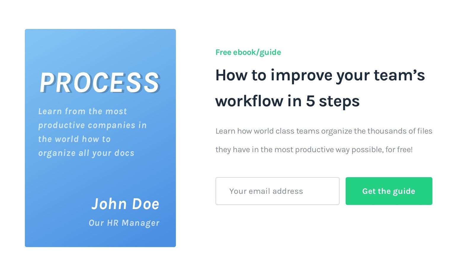
Using a lead magnet
If you are using Inbound Marketing to get leads then you probably already have a lead magnet to offer, which could also be a great way to build rapport with them and grab their contact info in case your sales/support team wants to follow up with them or even to capture leads at a bigger scale than what a small sales team might be able to do by themselves.
Lead magnets are a more long term approach but it’s a great way to capture leads were the timing to use your tool isn’t ideal just yet, plus you can definitely use both examples explained here, like I did in this concept page.